UNIS needed a major website upgrade to enhance its user experience and stand out in the logistics industry. The original Squarespace site didn't represent the brand or meet user expectations. Our mission was to transform UNIS's digital presence to align with the company's evolving needs and user expectations.
Challenges
The Existing Website's Core Issues
Brand Representation
The existing website didn't effectively convey the UNIS brand. It lacked visual coherence and failed to reflect the company's values and identity, essential for building trust and recognition in the logistics industry.
User Experience
The website fell short of modern user experience standards. Navigation was inconsistent, and the design was outdated, leading to a frustrating user experience that could deter potential clients and partners.
Competition
UNIS needed to stand out in the highly competitive logistics market. The original site lacked distinction, making it difficult for UNIS to differentiate itself from competitors and capture the attention of potential customers.
Design Objectives
Branding and Visuals
Our objectives were to build a reliable brand, increase user engagement, and improve visual design, creating a compelling online presence.
User Research
Contact Preferences and User Flow Feedback
Feedback revealed a preference for contacting UNIS via phone or LinkedIn. Interviews with stakeholders and fellow coworkers indicated 95% felt the website needed substantial changes.
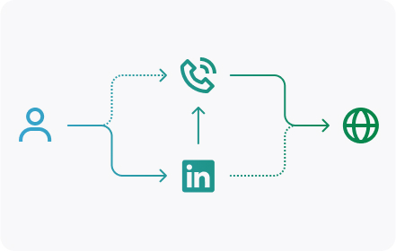
Before: Users found it simpler to learn about the company through LinkedIn compared to gathering information on the website.
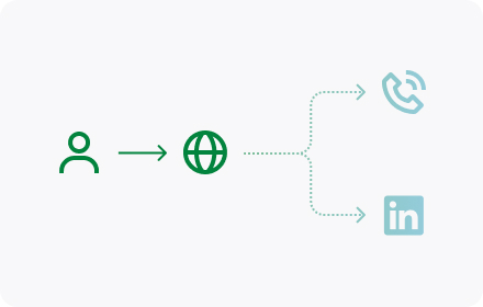
After: Redesigned the company website and implemented an SEO strategy to attract users and provide comprehensive information about the company.
Competitive Analysis
Inspiration from Industry Leaders
We drew inspiration from industry leaders like Apple and UPS, aiming to incorporate their efficient and organized design principles.
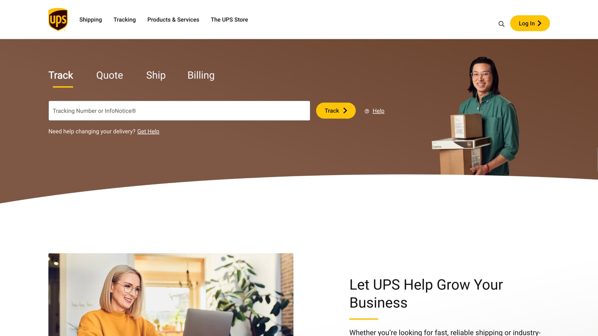
We aimed to incorporate a package tracking system for UNIS clients, allowing real-time monitoring of bulk shipments to improve visibility, client satisfaction, and streamline the logistics process.

Our goal was to modernize the UNIS logistics website with a sleek, Apple-inspired design. This contemporary look aimed to enhance user experience and effectively showcase our logistics solutions.
Design Principles
Simplicity, Consistency, and Balance
We focused on simplicity and clarity, tailoring the user journey for diverse audiences to ensure easy navigation and information access. By ensuring a consistent visual design and standardized interactions, we reinforced brand recognition and provided a seamless user experience. Balancing aesthetic appeal with practicality, we optimized the design to meet the logistics industry's specific needs, making the website both attractive and highly efficient.

Information Architecture
Improving the Locations Page
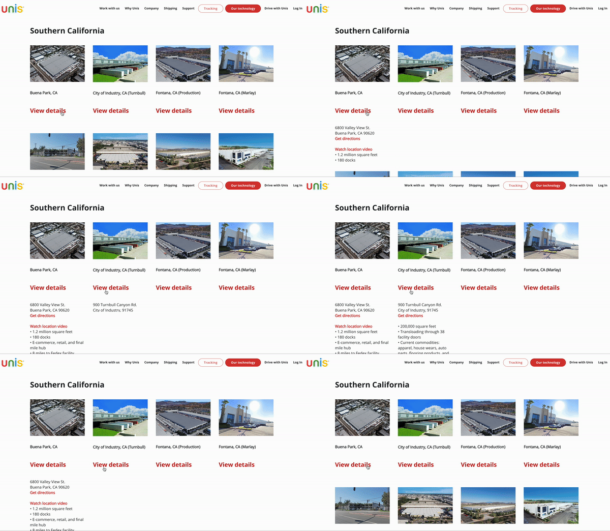
Before: Limited view of locations and significant white space when the user clicks 'View details'
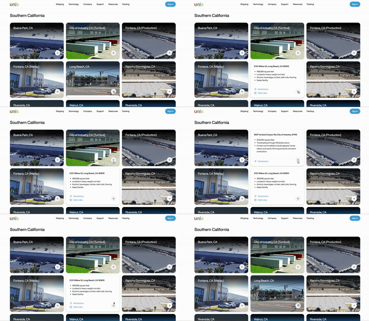
After: Restructured with intuitive navigation and flashcard interaction
Interactivity
Carousel Slider
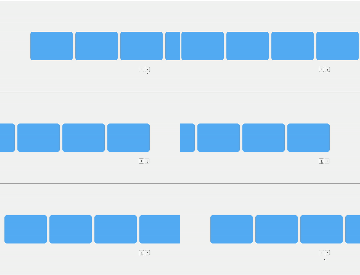
Prototype: I prioritized developing low-fidelity interactions first to ensure functionality and usability before visual design.
Polished: I utilized SplideJS for a sophisticated carousel slider, enhancing interactivity.
Sitemapping
Navigation Bar

Before: Necessary functions but lacked clarity; red CTA button deterred clicks.

After: Changed CTA to blue, refined interactions, and improved clarity with smooth transitions.
Component
Infinite Marquee
I also developed a custom infinite marquee showcasing trusted partners to add dynamic visual interest and credibility.
100%
C-suite Stakeholder Approval
Conclusion
Stakeholder Feedback
The CEO, CTO, and CCO were highly satisfied with the redesign, noting its potential to generate new business and attract a larger workforce. The improved website not only enhanced the company's ability to engage potential clients but also significantly supported the talent acquisition team by creating a more compelling and user-friendly application process. This upgrade made the company website a more attractive destination for top talent, thereby increasing the number of qualified applicants.
Update!
Post-Launch Performance
Three months post-redesign, the website saw a significant traffic increase and a reduced bounce rate from 55% to 25%.

Additional Content
The Design System
In collaboration with Sean Baik, I optimized the design system by integrating Figma variables, developing a component development workflow, and ideating web block components for use across our UNIS products.
 View in Figma
Additional Content
Client Portal Onboarding Flow
I was in charge of designing the Sign In/Sign Up user flow for the UNIS Client Portal. I made sure to incorporate various use cases and special edge cases. If you're interested in this project, I'd be happy to share more about it!
 View in Figma